7-Quality Control Tools
7-Quality Control Tools
The seven basic tools of quality is a designation given to a fixed set of graphical techniques identified as being most helpful in troubleshooting issues related to quality. They are called basic because they are suitable for people with little formal training in statistics and because they can be used to solve the vast majority of quality-related issues.
These seven basic tools of quality, first emphasized by Kaoru Ishikawa, a professor of engineering at Tokyo University and the father of "quality circles."
Types of 7-Tools-
The seven tools are:
1. Check sheet
2. Control chart
3. Stratification (alternatively, flow chart or run chart)
4. Pareto chart
5. Histogram
6. Cause-and-effect diagram (also known as the "fishbone diagram" or Ishikawa diagram)
7. Scatter diagram
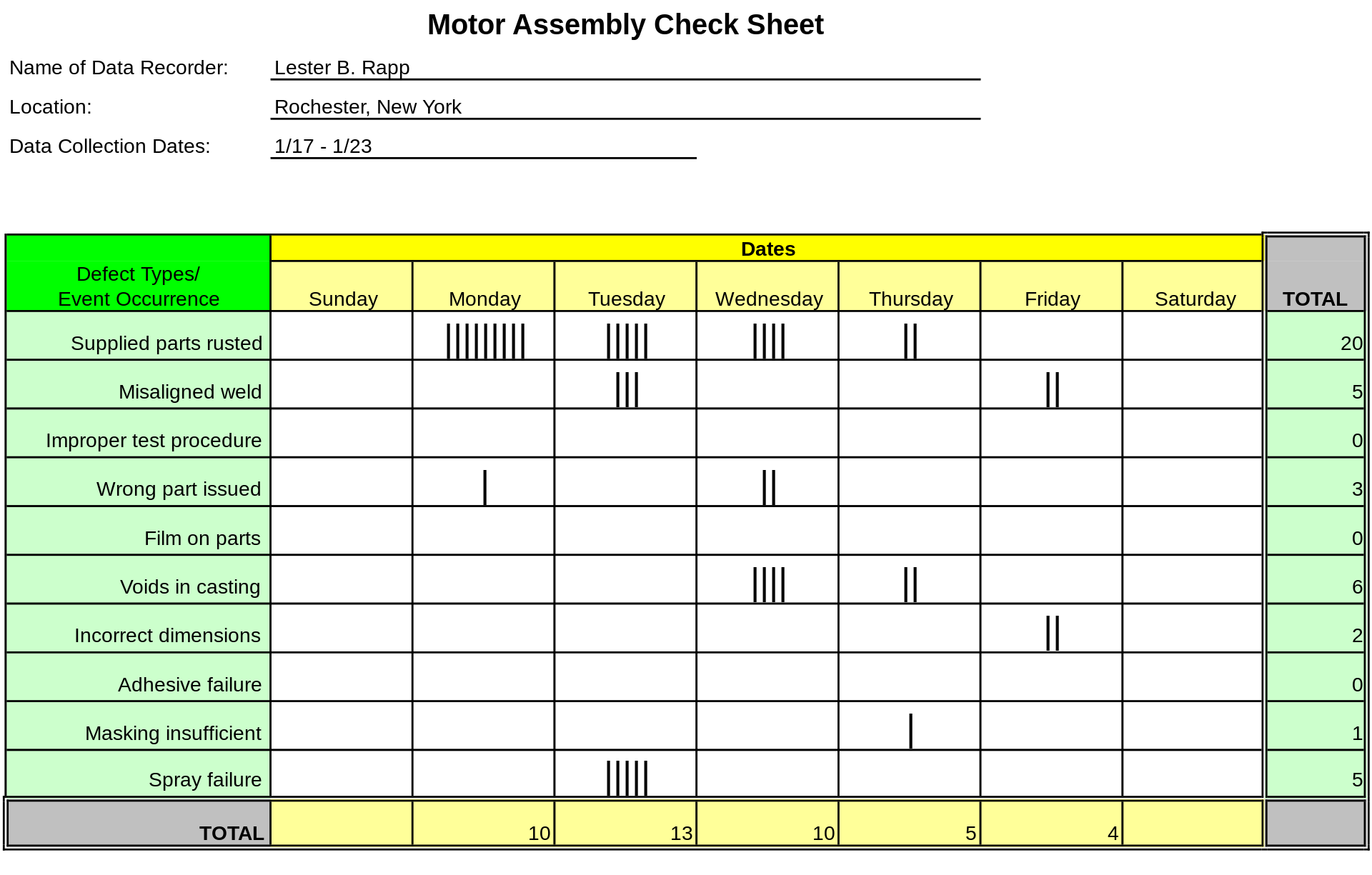
1. Check sheet- A structured, prepared form for collecting and analyzing data; a generic tool that can be adapted for a wide variety of purposes. checklists are tools that make the data collection process easier by providing pre-written descriptions of events likely to occur.

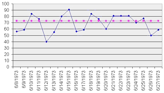
2. Control chart- Graphs used to study how a process changes over time. Data are plotted in time order. A control chart always has a central line for the average, an upper line for the upper control limit, and a lower line for the lower control limit. These lines are determined from historical data. By comparing current data to these lines, you can draw conclusions about whether the process variation is consistent (in control) or is unpredictable (out of control, affected by special causes of variation).

3. Stratification (alternatively, flow chart or run chart)- A process flow chart is simply a tool that graphically shows the inputs, actions, and outputs of a given system. These terms are defined as follows:
Inputs—the factors of production: land, materials, labor, equipment, and management.
Actions—the way in which the inputs are combined and manipulated in order to add value. Actions include procedures, handling, storage, transportation, and processing.
Outputs—the products or services created by acting on the inputs. Outputs are delivered to the customer or other user. Outputs also include unplanned and undesirable results, such as scrap, rework, pollution, etc. Flow charts should contain these outputs as well.
Flow charts can be used to identify improvement opportunities as illustrated by the following sequence:
1. Organize a team for the purpose of examining the process
2. Construct a flow chart to represent each process step
3. Discuss and analyze each step in detail
4. Ask the key question, “Why do we do it this way?”
5. Compare the actual process to an imagined “perfect” process
6. Is there unnecessary complexity?
7. Does duplication or redundancy exist?
8. Are there control points to prevent errors or rejects? Should there be?
9. Is this process being run the way it should?
10. Improvement ideas may come from substantially different processes


4. Pareto chart- Shows on a bar graph which factors are more significant. Pareto analysis should be used at various stages in a quality improvement program to determine which step to take next. Pareto analysis is used to answer such questions as “What department should have the next SPC team?” or “On what type of defect should we concentrate our efforts?”

5. Histogram- The most commonly used graph for showing frequency distributions, or how often each different value in a set of data occurs. A histogram is a pictorial representation of a set of data. It is created by grouping the measurements into “cells.” Histograms are used to determine the shape of a data set. Also, a histogram displays the numbers in a way that makes it easy to see the dispersion and central tendency and to compare the distribution to requirements.
Histograms have the following characteristics:
1. Frequency column graphs that display a static picture of process behavior. Histograms require a minimum of 50-100 data points.
2. A histogram is characterized by the number of data points that fall within a given bar or interval. This is commonly referred to as “frequency.”
3. A stable process is frequently characterized by a histogram exhibiting unimodal or bell-shaped curves. A stable process is predictable.
4. An unstable process is often characterized by a histogram that does exhibit a bell-shaped curve. Obviously other more exotic distribution shapes (like exponential, lognormal, gamma, beta, Weibull, Poisson, binomial, hypergeometric, geometric, etc.) exist as stable processes.
5. When the bell curve is the approximate distribution shape, variation around the bell curve is chance or natural variation. Other variation is due to special or assignable causes.


6. Cause-and-effect diagram (also known as the "fishbone diagram" or Ishikawa diagram)- Identifies many possible causes for an effect or problem and sorts ideas into useful categories.

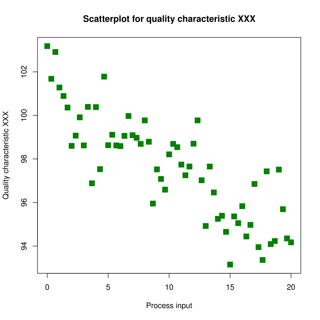
7. Scatter diagram- A scatter diagram is a plot of one variable versus another. One variable is called the independent variable and it is usually shown on the horizontal (bottom) axis. The other variable is called the dependent variable and it is shown on the vertical (side) axis. Scatter diagrams are used to evaluate cause and effect relationships. The assumption is that the independent variable is causing a change in the dependent variable. Scatter plots are used to answer such questions as “Does vendor As material machine better than vendor B’s?” “Does the length of training have anything to do with the amount of scrap an operator makes?” and so on.


Comments
Post a Comment