TQM TOOLS & TECHNIQUES
TQM TOOLS & TECHNIQUES
Statics is defined as
the science that deals with the collection, tabulation, analysis,
interpretation & presentation of quantitative data.
statistical
techniques are applicable in all situations where quantification is possible. Example- Engineering, commerce, industry, trade, economics, life
science, earth science, physical science, medical science etc.
Data Vs Information
Data |
Information |
|
Data is raw, unorganized facts
that need to be processed. Data can be something simple and seemingly random
and useless until it is organized.
|
When data is processed,
organized, structured or presented in a given context so as to make it
useful, it is called information.
|
|
Example-Each
student's test score is one piece of data.
|
Example-The
average score of a class or of the entire school is information that can be
derived from the given data.
|
Types of data-
1. Attribute
data-
The data obtained by
counting are called discrete (or attributes) data. It’s has two types Yes/no
types & Counting types. It’s very simple to collect as compared to variable
data. Example- Mail deliver- it’s on time or not on time? Phone answer, product
confirmation Number of students pass in class? etc.
2. Variable
data-
The data obtained by
actual measurement are continuous (or variable data). Example Sampling
inspection plan we are taking one sample out of 10 parts & check the weight
of it. so the reading should be digit or in number are variable like 250, 255,
248 grams etc.
Measures of Central
Tendency: -
A
measure of central tendency is a summary statistic that represents the center
point or typical value of a dataset. These measures indicate where most values
in a distribution fall and are also referred to as the central location of a distribution.
In statistics, the three most common measures of central tendency
are the mean, median, and mode.
1. Mean-The mean is also called arithmetic average, is the sum of the observations divided by numbers of
observations.
2. Median-The median is the middle value. if data contains an
odd numbers of items, the median item of the array. if there is an even number
of items, it’s the arithmetic mean of two middle numbers.
To
find median-
If there are ‘n’ observations of the variant& they
are arranged in ascending order, then median is given by (n+1)/2 value if ‘n’ is odd.
If ‘n’ is even then median is taken average of (n/2) or (n/2 +1).
3. Mode-the mode is most commonly occurring value. it’s defined as “The valve
of the variable which occurs most frequently i.e., the value of maximum
frequency.
Measure of Dispersion or Measure of Precision-
The spread of observations around the Centre is known as
dispersion. There are three measure of dispersion-
1. Range-It’s
defined as the difference between the highest & lowest observations.
Mathematically Mean
R = Xh-Xl
Where R= Range
Xh = Highest observation value
Xl = Lowest observation value
2. Mean deviation-The
mean deviation is the mean of absolute difference of the values from the mean,
median or mode.
Mean Deviation
Where A= Mean or mode or median of observations.
3. Standard Deviation-It’s measure of spread of data. Standard deviation is compute as
the square root of the mean of the squares of the difference of variate values
from their mean.
Where S= Standard
deviation
Xi= Observed
values
N = Number of observed
values
Control Chart-
A control chart is a
graph that displays data taken over time & the variations of data. It’s a
tool to distinguish between chance & assignable causes of variations in a
process.
The controlled chart is
used to check whether the process is controlled statically or not. The main
objective of using control chart is to determine when a process is
out-of-control so that necessary action may be taken.
Types of control chart-
There
are two basic types of control chart
1. Control Chart for Variables-
It’s measurement of quality characteristic of interest. The most commonly used variable control charts are-
1. X Bar or Average chart- It’s
used to monitor the centering of process to control its accuracy.

2. R or Range chart-
It’s monitor the dispersion or precision of the process.

3. S or Standard Chart-
It’s shows the variation of process.
2. Control Chart for Attributes –
It’s required a determination of whether a part is defective or
how many defects are there in a sample.
1. P-Chart- The chart for fraction
rejected as non-conforming to specifications.

2. NP- Chart – The control chart for
number of non-conducting items.

3. C-Chart- The control chart for
number of non-conformities.

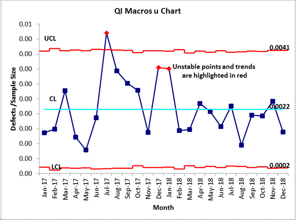
4. U-Chart- The control chart for
number on non-conformities per unit.


Comments
Post a Comment